Tutorial: Adobe Photoshop basics – Levels
I browse about 100-400 pictures / day on flickr, and I notice a lot of pictures out there are underexposed or overexposed. The truth is, if a picture is overexposed, there really isn’t much you can do to save it; but if it’s underexposed, you have a pretty good chance of saving it. To understand this, you have to understand how your digital sensor works. It works much like film in this case: When there’s too much light exposed to your sensor for too long, it exceeds its capability to pick up any color information, and as a result, it turns into 100% white. We call that a blown-out spot. There are times when it is intentional to leave some spots blown-out in order to allow proper exposure to happen in other areas in a picture, but in general it is not desirable. If you shoot in RAW format, you still have a chance to adjust it when you process the picture. But before I lose you, let’s go back to the subject and talk about underexposure.
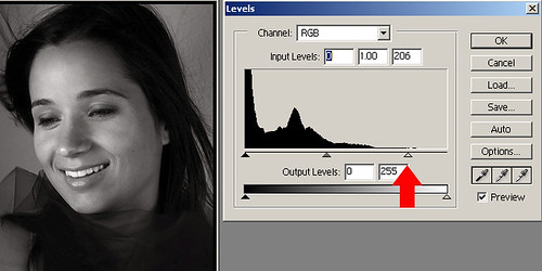
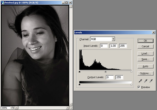
Below is a typical underexposed picture, but not by far. It’s not a subjective thing, but is actually factual that you can see from the levels histogram as shown below:
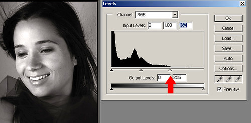
Notice the histogram does not stretch all the way to the end, but rather lies from left to right about 65% of the way. In order to fix this and properly expose this picture, you should theoretically slide the right arrow to the end of the histogram, thus telling your photo editing program that the brightest spot of the picture is… right there (where the red arrow shows). Let’s put it in a different way so you understand this better: You’re basically telling the program that you want to discard anything on the right of the histogram, in this case almost nothing, and use where that arrow points as the brightest spot in the picture.
Before we move on, look at the picture once again, and notice the teeth of the beautiful lady in the picture is unfortunately blown-out! Right… you just told the picture to set the brightest spot, and hey Herman you messed up the picture! Ahem… that’s why I said theoretically earlier! In most cases you should do that, but in this image, nope! The image was shot with a pretty strong light source somewhat facing the lady’s face, and her teeth unfortunately caught more light than the rest of the face, and it became the brightest spot in the image. Sure there are a lot of ways to fix this, but let’s stay with the basics this time. What we’re going to do here is to ease up the earlier adjustment to what’s shown below:
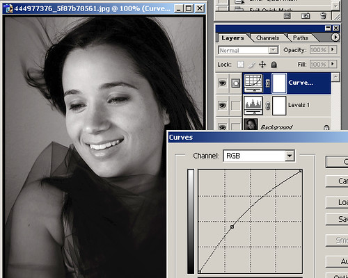
Ahha! better… the face looks more natural, although not perfectly exposed. Now that you know that you have definitely improved the image, but not exposed it perfectly just yet. We’re going to try the curves tool to bring up a little bit more light around the mid-tones, while leaving the brightest spots (the teeth, for example) alone. Look at the image below again:
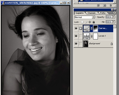
Yay it’s coming along… but it looks too bright again, particularly in the facial area. Correct, and this is how we’re going to fix this final part of the image. We’re going to tell the program that we want this effect that we just did, but only apply it fully at the bottom of the screen, and gradually blend into almost no adjustment towards the top of the head, in a sense that the face wouldn’t catch too much of the ill-effect we just did. What we’ll do is to click on the mask of the adjustment layer we just did, and draw a gradient from lower right to upper left in white to black seen below:
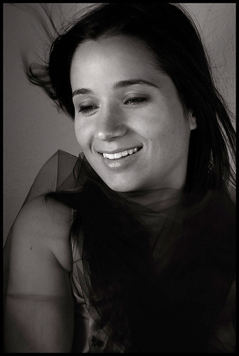
Tada! That’s it and we’re done! Before you quickly save it and upload it to flickr, please listen to me before you wrap it up. Remember you’re trying to enhance the image, not alter it dramatically here. Your adjustments MUST be gradual in order to maintain subtleness. Remember you don’t want to be seen over-adjusting, and you want to always go back and forth to compare the before and after picture and see if you really improved it, or if you actually made it worse! Here’s a quick comparison of the before and after shot.
Recap: We used the levels tool to better expose the shot, then we used the curves tool to bring out the mid-tones, and finally used a layer mask to mask off some of the effects of the curves tool to avoid making the face too bright. Questions, suggestions, feel free to exercise your freedom of speech! ;-)
Credits: Big thanks to .Hortencia.Caires. on Flickr for allowing me to use her beautiful picture as an example here!
Additional notes: A reader asked me to explain further about the histogram on Efania and I decided to post it here too:
I’m glad you asked because I was afraid I’ll lose most readers if I explained too much in depth. The x-axis of the histogram represents from left to right, complete darkness to complete brightness. The y-axis represents the amount of pixels. in this example it’s showing RGB meaning Red/Green/Blue channel, but since this is a b/w image it’s only representing luminance, or the amount of light.
In this above example, translating into plain English:
There’s a lot of complete darkness, mostly in her clothings in the lower right of the full image, some in the hair. At around 25% to 50% of the x-axis we’ve got quite a bit of information too, representing the darker gray tones of the picture: part of her face, her arms, the background; the rest of the information from 50% to 75% or so which has only quite a few pixels the bright part of her face; and finally there are no pixels from 75%-100% brightness int he image, meaning it’s under exposed. But in reality, since we want to avoid properly exposing the entire image resulting in the teeth overexposing, we resorted to using the curves and a layer mask to selectively bring out more details of the significant part of the image and leaving the original feel of lighting intact.
Hope I explained this better this time… :-)
Afterwods: If I were adjusting this image myself, I would probably try to isolate the teeth and part of her forehead using a layer mask made in combination of magic wand, gaussian blur, paint brush / quick mask to make it closer to perfect. But we’ll probably save it for later… :-)


